


Hi folks! I am a 👨💻 Full-Stack Developer, occasional Designer, and Blogger facilitating the world with User Experience 🧐 as a Design Thinker 💭 and User-Centric Developer 💯 and while also exploring ☁️ Cloud
Working 💼 @HackerRank as a Software Development Engineer 2
🤓 I have a keen interest in 🤝 collaborating with others and empowering others to build digital solutions that solve real-world 🌍 problems. I'm a Creative Technologist who believes that the merger between Design Thinking and Digital Technologies will lead to the building of user-centric solutions that are impactful toward the betterment of business & society.
Simple animations can bring a huge difference to your websites. Let's build something simple and unique.
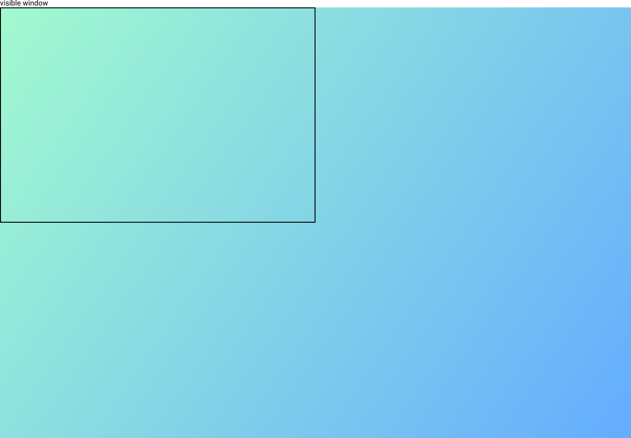
Complete page background animation with CSS moving gradient
The above Codepen example shows a moving gradient animation on the whole body of the website.
Code snippet for the animation effect.
HTML 👇
<body>
  <h1>
     Animation effect on "body"
  </h1>
</body>
CSS 👇
body {
  background: -webkit-linear-gradient(
    -70deg,
    #a2facf,
    #64acff
  );
  background-size: 400% 400%;
  animation: gradient 5s ease infinite;
}

@keyframes gradient {
  0% {
    background-position: 0% 50%;
  }
  50% {
    background-position: 100% 50%;
  }
  100% {
    background-position: 0% 50%;
  }
}
So, What is happening ??
The background size here is 400% 400% and the background is moving. Thus, the animation is happening.
A lot of cool stuff can be coded with this type of animation.
1. 🌈 Rainbow Effect
The above Codepen example shows a 🌈 rainbow effect.
This is similar to the animation that we saw in the previous example but with 7 colors.
2. Loader for cards and simple components.
The above Codepen example shows a loader 🐌 with the same gradient animation.
3. Implementing the same effect on a button or cards
The above Codepen example shows 🌈 the rainbow effect on a button.
4. On Hover the same animation effect
Animation on hovering on the card
Configurable parameters
- Changing the
background-size - Changing the
time-duration - Changing the
degreeof the linear gradient.
Now, put on your creative 🤠 hats and make an interesting animation effect with moving gradients.
Drop the website link in the comments for which you would be doing it or have done it.
Show your love by Sharing the blog. 🤗


